CSS Flexbox Properties for flex item (1)
Information drawn from
These snack covers these flex items properties: order, flex-grow, flex-shrink, flex-basis , flex and align-itself
order
By default, flex items are laid out in the source order. However, the order property controls the order in which they appear in the flex container.
.item {
  order: <integer>; /* default is 0 */
}
flex-grow
This defines the ability for a flex item to grow if necessary. It accepts a unitless value that serves as a proportion. It dictates what amount of the available space inside the flex container the item should take up.
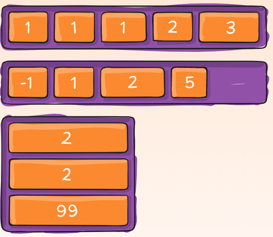
If all items have flex-grow set to 1, the remaining space in the container will be distributed equally to all children. If one of the children has a value of 2, the remaining space would take up twice as much space as the others (or it will try to, at least).
.item {
  flex-grow: <number>; /* default 0 */
}
Negative numbers are invalid.
flex-shrink
This defines the ability for a flex item to shrink if necessary.
.item {
  flex-shrink: <number>; /* default 1 */
}
Negative numbers are invalid.
flex-basis
This defines the default size of an element before the remaining space is distributed. It can be a length (e.g. 20%, 5rem, etc.) or a keyword. The auto keyword means “look at my width or height property” (which was temporarily done by the main-size keyword until deprecated). The content keyword means “size it based on the item’s content” - this keyword isn’t well supported yet, so it’s hard to test and harder to know what its brethren max-content, min-content, and fit-content do.
.item {
  flex-basis: <length> | auto; /* default auto */
}
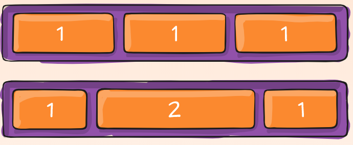
If set to 0, the extra space around content isn’t factored in. If set to auto, the extra space is distributed based on its flex-grow value. See this graphic.
flex
This is the shorthand for flex-grow, flex-shrink and flex-basis combined. The second and third parameters (flex-shrink and flex-basis) are optional. The default is 0 1 auto, but if you set it with a single number value, it’s like
.item {
  flex: none | [ <'flex-grow'> <'flex-shrink'>? || <'flex-basis'> ]
}
It is recommended that you use this shorthand property rather than set the individual properties. The shorthand sets the other values intelligently.
align-self
One item with a align-self value is positioned along the bottom of a flex parent instead of the top where all the rest of the items are. This allows the default alignment (or the one specified by align-items) to be overridden for individual flex items.
Please see the align-items explanation to understand the available values.
.item {
  align-self: auto | flex-start | flex-end | center | baseline | stretch;
}
Note that float, clear and vertical-align have no effect on a flex item.
------------------------------------------------------------------------
Last update on 25 Jan 2020
---