CSS Flexbox Properties for flex container (1)
Information drawn from
In this snack we will introduce display, flex-direction and flex-wrap.
display
This defines a flex container inline or block depending on the given value. It enables a flex context for all its direct children.
.container {
  display: flex; /* or inline-flex */
}
Note that CSS columns have no effect on a flex container.
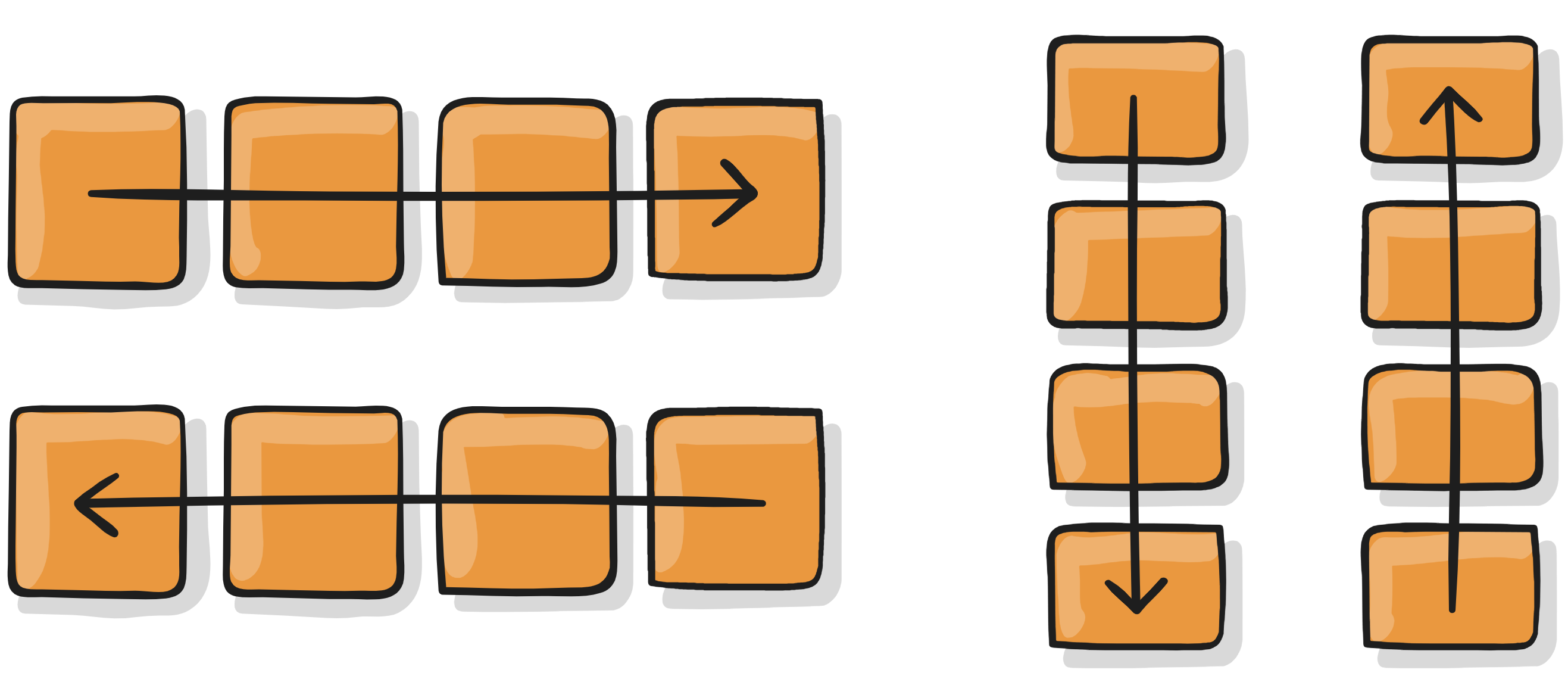
flex-direction
This establishes the main-axis, thus defining the direction flex items are placed in the flex container. Flexbox is (aside from optional wrapping) a single-direction layout concept. Think of flex items as primarily laying out either in horizontal rows or vertical columns.
.container {
  flex-direction: row | row-reverse | column | column-reverse;
}
flex-wrap
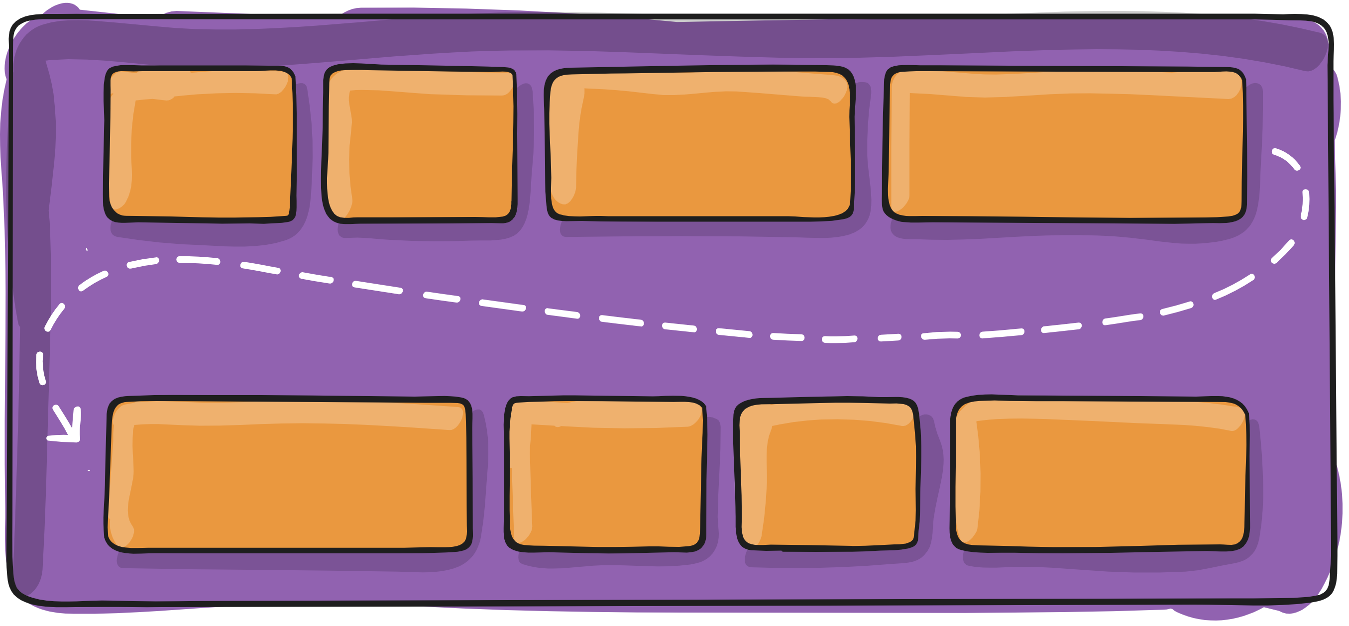
By default, flex items will all try to fit onto one line. You can change that and allow the items to wrap as needed with this property.
.container{
  flex-wrap: nowrap | wrap | wrap-reverse;
}
------------------------------------------------------------------------
Last update on 26 Jan 2020
---