CSS Flexbox Properties for flex container (2)
Information drawn from
These snacks will core these flex properties: flex-flow, justify-content and align-items
flex-flow
Applies to: parent flex container element This is a shorthand for the flex-direction and flex-wrap properties, which together define the flex container’s main and cross axes. The default value is row nowrap.
flex-flow: <‘flex-direction’> || <‘flex-wrap’>
justify-content
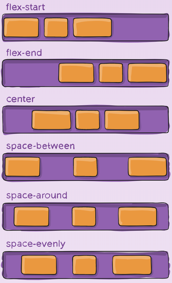
This defines the alignment along the main axis. It helps distribute extra free space leftover when either all the flex items on a line are inflexible, or are flexible but have reached their maximum size. It also exerts some control over the alignment of items when they overflow the line.
.container {
  justify-content: flex-start | flex-end | center | space-between | space-around | space-evenly | start | end | left | right ... + safe | unsafe;
}
Note that that browser support for these values is nuanced. For example, space-between never got support from some versions of Edge, and start/end/left/right aren’t in Chrome yet. MDN has detailed charts. The safest values are flex-start, flex-end, and center.
There are also two additional keywords you can pair with these values: safe and unsafe. Using safe ensures that however you do this type of positioning, you can’t push an element such that it renders off-screen (e.g. off the top) in such a way the content can’t be scrolled too (called “data loss”).
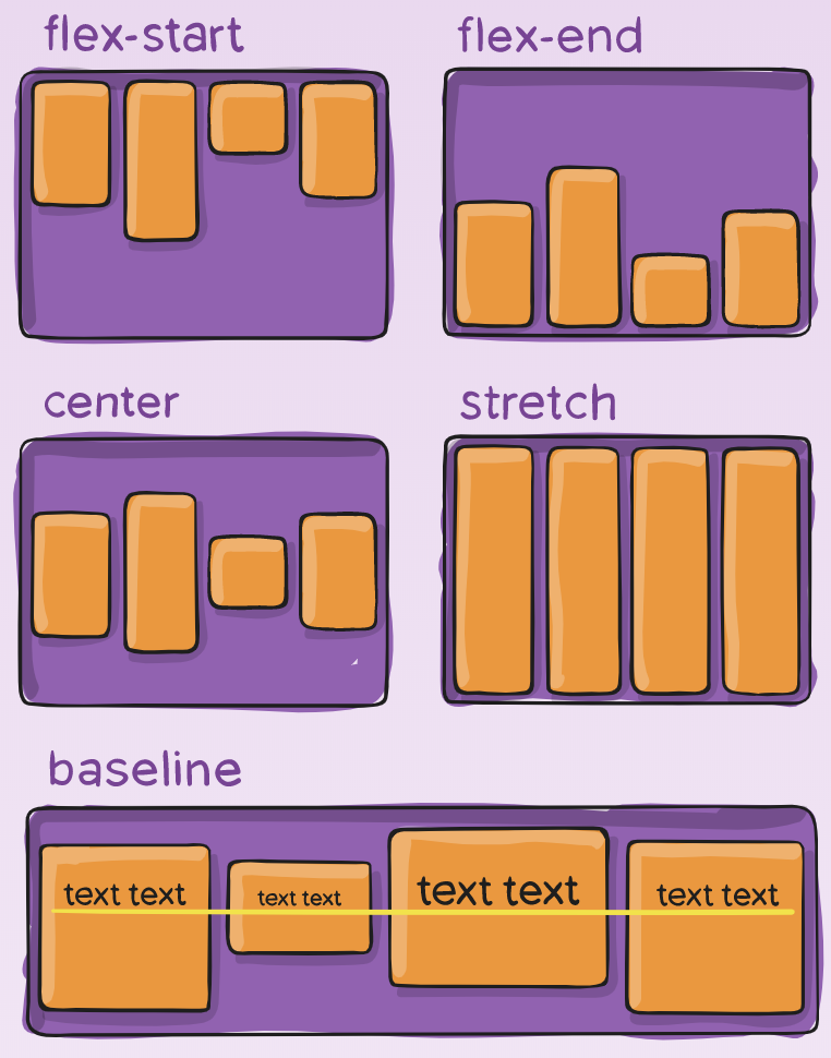
align-items
This defines the default behavior for how flex items are laid out along the cross axis on the current line. Think of it as the justify-content version for the cross axis (perpendicular to the main-axis).
.container {
  align-items: stretch | flex-start | flex-end | center | baseline | first baseline | last baseline | start | end | self-start | self-end + ... safe | unsafe;
}
The safe and unsafe modifier keywords can be used in conjunction with all the rest of these keywords (although note browser support), and deal with helping you prevent aligning elements such that the content becomes inaccessible.
align-content
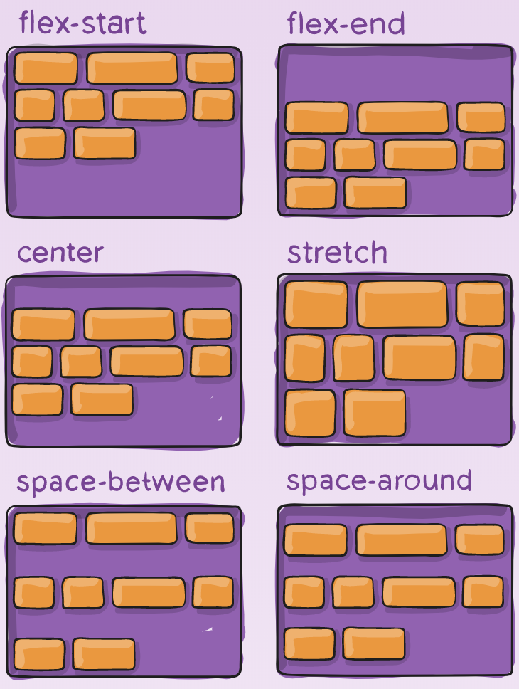
This aligns a flex container’s lines within when there is extra space in the cross-axis, similar to how justify-content aligns individual items within the main-axis.
Note: this property has no effect when there is only one line of flex items.
.container {
  align-content: flex-start | flex-end | center | space-between | space-around | space-evenly | stretch | start | end | baseline | first baseline | last baseline + ... safe | unsafe;
}
The safe and unsafe modifier keywords can be used in conjunction with all the rest of these keywords (although note browser support), and deal with helping you prevent aligning elements such that the content becomes inaccessible.
------------------------------------------------------------------------
Last update on 26 Jan 2020
---