CSS Grid Introduction
Information drawn from
CSS Grid Layout is the most powerful layout system available in CSS.
It is a 2-dimensional system, meaning it can handle both columns and rows, unlike flexbox which is largely a 1-dimensional system. You work with Grid Layout by applying CSS rules both to a parent element (which becomes the Grid Container) and to that element’s children (which become Grid Items).
CSS has always been used to lay out our web pages, but it’s never done a very good job of it. First, we used tables, then floats, positioning and inline-block, but all of these methods were essentially hacks and left out a lot of important functionality (vertical centering, for instance).
Flexbox helped out, but it’s intended for simpler one-dimensional layouts, not complex two-dimensional ones - Flexbox and Grid actually work very well together. Grid is the very first CSS module created specifically to solve the layout problems we’ve all been hacking our way around for as long as we’ve been making websites.
Basics and Browser Support
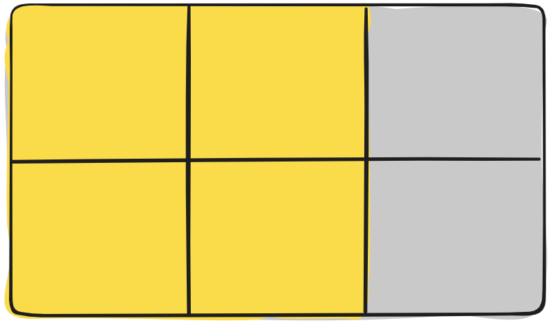
To get started you have to define a container element as a grid with display: grid, set the column and row sizes with grid-template-columns and grid-template-rows, and then place its child elements into the grid with grid-column and grid-row.
Similarly to flexbox, the source order of the grid items doesn’t matter. Your CSS can place them in any order, which makes it super easy to rearrange your grid with media queries. Imagine defining the layout of your entire page, and then completely rearranging it to accommodate a different screen width all with only a couple lines of CSS.
As of March 2017, most browsers shipped native, unprefixed support for CSS Grid: Chrome (including on Android), Firefox, Safari (including on iOS), and Opera. Internet Explorer 10 and 11 on the other hand support it, but it’s an old implementation with an outdated syntax.
------------------------------------------------------------------------
Last update on 25 Jan 2020
---