Challenge - Dropdown menu
Information drawn from
Problem
The nav bar on our site has become too cluttered!
By using a drop down menu item, we can group similar items and save room at top level for the most important links.
Here’s a mock from the designer showing what the updated nav bar should look like:
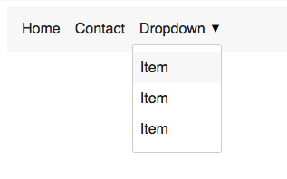
Can you create a nav bar that shows the drop down menu when clicked?
Hints
Not sure where to start? Focus on the HTML (including drop down) so you have something to work with
Add CSS classes to position the drop down as though it was always open
Use javascript the listen to clicks and manipulate the classes
Copy/paste this unicode character for the triangle symbol: ▼
Solution
This focus of this challenge is CSS positioning and how well you know the default element behaviors.
Since we can’t do much without HTML here, that’s a good place to start. Follow that up with the CSS required to position things, then create the javascript to control the show/hide behavior. To save time, do the “pixel perfect” CSS last (this includes things like colors, spacing, fonts etc).
Basic semantic nav HTML should look something like this:
<nav>
  <ul>
    <li>
      <a href="#">Home</a>
    </li>
    <li>
      <a href="#">Contact</a>
    </li>
    <li class="dropdown">
      <a href="#">Dropdown</a>
      <div class="dropdown__menu">
        <a href="#">Item</a>
        <a href="#">Item</a>
        <a href="#">Item</a>
      </div>
    </li>
  </ul>
</nav>
Notice the differences between a regular nav link and the drop down version:
- A wrapper class called .dropdown around the entire link
- A nested
<div>alongside the top level link - A .dropdown__menu class to wrap the contents of the drop down
The next step is to position the drop down menu exactly at the bottom of the link that triggers it. We can use position: absolute to achieve this:
.dropdown { position: relative; }
.dropdown--open .dropdown__menu {
  position: absolute;
  top: 100%;
  left: 0;
}
Now for the key functionality - showing/hiding the drop down with a CSS class, and controlling that class with javascript.
For that, create a class called .dropdown–open , then modify the CSS so that the drop down is hidden by default, and shows when it’s a child of the open class.
.dropdown { position: relative; }
.dropdown__menu { display: none; }

/* To make the drop down show on hover, uncomment the next line */
/* .dropdown:hover .dropdown__menu, */
.dropdown--open .dropdown__menu {
  display: block;
  position: absolute;
  top: 100%;
  left: 0;
}
Now the drop down will show when we add .dropdown–open. As a temporary measure, you could use the :hover selector to test the show/hide behavior, as shown in the code comments above.
Since the spec calls for showing the drop down on click, we’ll need some javascript to add/remove the .dropdown–open class.
To start, find all the drop down wrappers on the page and add event listeners so we can react to the click. Consider the fact that there may be multiple drop downs in the menu (or elsewhere on the page), so it’s important to make it generic.
// Listen to clicks on all drop downs
document.querySelectorAll('.dropdown')
  .forEach(el => el.addEventListener('click', handleClick))
Now to handle those clicks…

function handleClick(e) {

  // Prevent <a> links from changing the page
  e.preventDefault()
  const classList = e.currentTarget.classList

  // Check if the dropdown is currently open
  const isOpen = classList.contains('dropdown--open')
  if (isOpen) {
    classList.remove('dropdown--open')
  } else {
    classList.add('dropdown--open')
  }
}
Our event listener is attached the the <li class="dropdown"> element, so it will capture any clicks bubbling up from it’s children too.
Since one of the children is a link, we need to prevent the default behavior of navigating the page when it’s clicked using preventDefault().
To make sure we’re adding or removing the class from the <li> element and not one it’s children, it’s important to use e.currentTarget.
currentTarget is a reference to the element we added the event listener to. The more common e.target is the element that was actually clicked. In this case, the user could have clicked a link or something in the drop down menu — but thats not where we want to toggle the open class.
The next few lines use methods of classList to check if it already has the dropdown–open class, then add or remove it accordingly.
At this point, all the functionality of the drop down should be working, and all that’s left is final “polish” styles.
To get this looking like the mock, you’ll likely need to “reset” a few default browser styles like so:
/* Used on the <ul> element */
.nav__links {
  list-style: none;
  display: flex;
  margin: 0;
  padding: 0;
}

/* Used on the <a> menu links */
.nav__link {
  display: block;
  text-decoration: none;
  color: #222;
  padding: 0.5rem;
}
One “gotcha” is making the nav anchor links inline-block, instead of the default inline. This becomes obvious when you add padding to the inline element and it doesn’t expand it’s parent, breaking the position of the drop down.
Try experimenting with these display properties in the final solution.
------------------------------------------------------------------------
Last update on 02 Feb 2022
---