GatsbyJS - Use and Style React Components
Information drawn from
To build out the basic page structure for your blog site, you’ll need to know about React components and how Gatsby uses them.
By the end of this part of the Tutorial, you will be able to:
- Create page components to add new pages to your site.
- Import and use a pre-built component from another package.
- Create your own reusable “building block” component.
- Use component props to change the way a component renders.
- Use the children prop to create a wrapper component.
What is React?
React is the JavaScript library that Gatsby uses under the hood to create user interfaces (UIs). With React, you can break down your UI into smaller, reusable pieces called components.
For example, imagine the UI for an online store’s Products page:
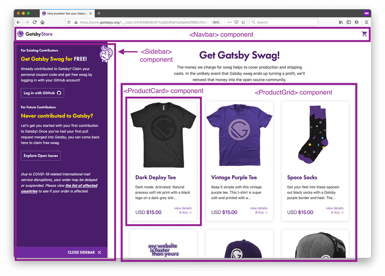
To build this page in React, you might have a <Navbar> component for the navigation menu, a <Sidebar> component for extra information displayed to the side of the main content, and a <ProductGrid> component to display all of the products for sale.
You can also create components from other components. For example, you might decide to break down the <ProductGrid> component into a list of multiple <ProductCard> components, which each display the details about a single product. This pattern is called composition, since your larger <ProductGrid> component is composed of smaller <ProductCard> components.
## What is a React component?
Under the hood, a React component is a function that returns a React element. A React element is an object that React uses to render DOM elements.
A component is a function that outputs a React component, written in JSX.
The simplest way to write React elements is with JSX. JSX is a JavaScript syntax extension that describes the DOM structure for your component. It looks a bit like having HTML in your JavaScript files:
const hello = <h1>Hello world!</h1>
So a simple React component might look something like this:
const Greeting = () => {
  return (
    <h1>Hello world!</h1>
  )
}
Create a page component
There are two main types of components in a Gatsby site. The first type you’ll create are page components. A page component contains all the UI elements for a specific page of your site.
In this section, you’ll create two new page components: one for the Home page and one for an About page.
The Home Page content is in src/index.js.
Task: Create a new page component for an About page
Now that you’ve updated the existing Home page, try creating a new page from scratch. Make an About page, so that you can tell people a little about yourself.
Create a new file: src/pages/about.js. Use the code below as a starting point for your About page.
src/pages/about.js
// Step 1: Import React
import * as React from 'react'
// Step 2: Define your component
const AboutPage = () => {
  return (
    <main>
      <title>About Me</title>
      <h1>About Me</h1>
      <p>Hi there! I'm the proud creator of this site, which I built with Gatsby.</p>
    </main>
  )
}
// Step 3: Export your component
export default AboutPage
Use the <Link> component
So far, your blog site has two separate pages (Home and About), but the only way to get from one page to the other is to update the URL manually. It would be nice to add links to make it easier to switch between pages on your site.
The Link component is an example of a pre-built component that you can use in your site. In other words, the Link component is defined and maintained by another package (in this case, the Gatsby package). That means you can import it and use it in your own components without knowing too much about how it works under the hood.
The Link component lets you add a link to another page in your Gatsby site. It’s similar to an HTML <a> tag, but with some extra performance benefits. The Link component takes a prop called to, which is similar to the <a> tag’s href attribute. The value should be the URL path to the page on your site you want to link to.
– Key Gatsby Concept – 💡
The Gatsby Link component provides a performance feature called preloading. This means that the resources for the linked page are requested when the link scrolls into view or when the mouse hovers on it. That way, when the user actually clicks on the link, the new page can load super quickly.
Use the Link component for linking between pages within your site. For external links to pages not created by your Gatsby site, use the regular HTML <a> tag.
–
Follow the steps below to add Link components to your Home and About pages.
On the Home page, import the Link component from the Gatsby package and add a link to your About page.
src/pages/index.js
import * as React from 'react'
import { Link } from 'gatsby'
const IndexPage = () => {
  return (
    <main>
      <title>Home Page</title>
      <h1>Welcome to my Gatsby site!</h1>
      <Link to="/about">About</Link>
      <p>I'm making this by following the Gatsby Tutorial.</p>
    </main>
  )
}
export default IndexPage
On the About page, import the Link component from the Gatsby package and add a link to your Home page.
src/pages/about.js
import * as React from 'react'
import { Link } from 'gatsby'
const AboutPage = () => {
  return (
    <main>
      <title>About Me</title>
      <h1>About Me</h1>
      <Link to="/">Back to Home</Link>
      <p>Hi there! I'm the proud creator of this site, which I built with Gatsby.</p>
    </main>
  )
}
export default AboutPage
Create a reusable layout component
If you take another look at the finished example blog, you might notice that there are some repeated parts of the UI across each page, like the site title and the navigation menu.
You could copy those elements into each page of your site separately. But imagine your site had dozens (or even thousands) of pages. If you wanted to make a change to the structure of your navigation menu, you’d have to go and update every one of those files separately. Yuck.
Instead, it would be better to create one common Layout component that groups all the shared elements to reuse across multiple pages. That way, when you need to make updates to the layout, you can make the change in one place and it will automatically be applied to all the pages using that component.
In this section, you’ll create your first custom building-block component: Layout. To do that, you’ll need to use a special React prop called children.
Follow the steps below to create a Layout component and add it to your Home and About pages.
Create a new file called src/components/layout.js. Insert the following code to define your Layout component. This component will render a dynamic page title and heading (from the pageTitle prop), a list of navigation links, and the contents passed in with the children prop. To improve accessibility, there’s also a <main> element wrapping the page-specific elements (the <h1> heading and the contents from children).
src/components/layout.js
import * as React from 'react'
import { Link } from 'gatsby'
const Layout = ({ pageTitle, children }) => {
  return (
    <div>
      <title>{pageTitle}</title>
      <nav>
        <ul>
          <li><Link to="/">Home</Link></li>
          <li><Link to="/about">About</Link></li>
        </ul>
      </nav>
      <main>
        <h1>{pageTitle}</h1>
        {children}
      </main>
    </div>
  )
}
export default Layout
Syntax Hint: You might have noticed that the Layout component uses a slightly different syntax for its props.
Now instead of looking like this:
const Layout = (props) => {
  ...
}
…it looks like this:
const Layout = ({ pageTitle, children }) => {
  ...
}
This is a JavaScript technique called destructuring.
Update your Home page component to use the Layout component instead of the hard-coded Link component you added in the previous section.
src/pages/index.js
import * as React from 'react'
import Layout from '../components/layout'
const IndexPage = () => {
  return (
    <Layout pageTitle="Home Page">
      <p>I'm making this by following the Gatsby Tutorial.</p>
    </Layout>
  )
}
export default IndexPage
Update your About page component to use the Layout component as well. src/pages/about.js
import * as React from 'react'
import Layout from '../components/layout'
const AboutPage = () => {
  return (
    <Layout pageTitle="About Me">
      <p>Hi there! I'm the proud creator of this site, which I built with Gatsby.</p>
    </Layout>
  )
}
export default AboutPage
Style components with CSS Modules
Now that you’ve got your page structure set up, it’s time to add some style and make it cute!
Gatsby isn’t strict about what styling approach you use. You can pick whatever system you’re most comfortable with.
In this Tutorial, you’ll use CSS Modules to style your components. This means that styles will be scoped to components, which helps avoid class naming collisions between components. Gatsby is automatically configured to handle CSS Modules - no extra setup necessary!
Follow the steps below to style your Layout component using CSS Modules.
Create a new file: src/components/layout.module.css. (The .module.css part at the end is important! That’s what tells Gatsby that these styles are using CSS Modules.)
Start by adding a single .container class:
src/components/layout.module.css
.container {
  margin: auto;
  max-width: 500px;
  font-family: sans-serif;
}
Then import that class into your Layout component .js file, and use the className prop to assign it to the top-level <div> element:
src/components/layout.js
import * as React from 'react'
import { Link } from 'gatsby'
import { container } from './layout.module.css'
const Layout = ({ pageTitle, children }) => {
  return (
    <div className={container}>
      <title>{pageTitle}</title>
      <nav>
        <ul>
          <li><Link to="/">Home</Link></li>
          <li><Link to="/about">About</Link></li>
        </ul>
      </nav>
      <main>
        <h1>{pageTitle}</h1>
        {children}
      </main>
    </div>
  )
}
export default Layout
Syntax Hint: To apply classes to React components, use the className prop. (This is another example of a built-in prop that React automatically knows how to handle.)
This might be confusing if you’re used to using the class attribute on HTML elements. Do your best to not mix them up!
Now that you’ve seen how to style a single element for your component, add some more styles to apply to the other elements in your Layout component. src/components/layout.module.css
.container {
  margin: auto;
  max-width: 500px;
  font-family: sans-serif;
}
.heading {
  color: rebeccapurple;
}
.nav-links {
  display: flex;
  list-style: none;
  padding-left: 0;
}
.nav-link-item {
  padding-right: 2rem;
}
.nav-link-text {
  color: black;
}
Import the new classes into your Layout component, and apply each class to the corresponding element. src/components/layout.js
import * as React from 'react'
import { Link } from 'gatsby'
import {
  container,
  heading,
  navLinks,
  navLinkItem,
  navLinkText
} from './layout.module.css'
const Layout = ({ pageTitle, children }) => {
  return (
    <div className={container}>
      <title>{pageTitle}</title>
      <nav>
        <ul className={navLinks}>
          <li className={navLinkItem}>
            <Link to="/" className={navLinkText}>
              Home
            </Link>
          </li>
          <li className={navLinkItem}>
            <Link to="/about" className={navLinkText}>
              About
            </Link>
          </li>
        </ul>
      </nav>
      <main>
        <h1 className={heading}>{pageTitle}</h1>
        {children}
      </main>
    </div>
  )
}
export default Layout
Syntax Hint: In CSS, the convention is to name classes using kebab case (like .nav-links). But in JavaScript, the convention is to name variables using camel case (like navLinks).
Luckily, when you use CSS Modules with Gatsby, you can have both! Your kebab-case class names in your .module.css files will automatically be converted to camel-case variables that you can import in your .js files.
Key takeaways
- React is a library that helps you break down your UI into smaller pieces called components. A component is a function that returns a React element. React elements can be written in JSX.
- Page components contain all the UI elements for a specific page of your site. Gatsby automatically creates pages for components that are the default exports of files in the src/pages directory. The name of the file will be used as the route for the page.
- Building-block components are smaller reusable parts of your UI. They can be imported into page components or other building block components.
- You **can import pre-built components (like Link) **from other packages, or you can write your own custom components from scratch (like Layout).
- You can use props to change how a component renders. You can define your own props when you build a component. React also has some built-in props, like children and className.
- Gatsby isn’t opinionated about what styling approach you want to use, but it works with CSS Modules by default.
------------------------------------------------------------------------
Last update on 03 Nov 2021
---