Accessibility - CSS accessibility best practices
Information drawn from
CSS and JavaScript, when used properly, also have the potential to allow for accessible web experiences … or they can significantly harm accessibility if misused. This article outlines some CSS and JavaScript best practices that should be considered to ensure even complex content is as accessible as possible.
CSS and JavaScript are accessible?
CSS and JavaScript don’t have the same immediate importance for accessibility as HTML, but they are still able to help or damage accessibility, depending on how they are used. To put it another way, it is important that you consider some best practice advice to make sure that your use of CSS and JavaScript doesn’t ruin the accessibility of your documents.
CSS
Let’s start off by looking at CSS.
Correct semantics and user expectation
It is possible to use CSS to make any HTML element look like anything, but this doesn’t mean that you should. As we frequently mentioned in our HTML: A good basis for accessibility article, you should use the appropriate semantic element for the job, whenever possible. If you don’t, it can cause confusion and usability issues for everyone, but particularly users with disabilities. Using correct semantics has a lot to do with user expectations — elements look and behave in certain ways, according to their functionality, and these common conventions are expected by users.
As an example, a screen reader user can’t navigate a page via heading elements if the developer hasn’t appropriately used heading elements to markup the content. By the same token, a heading loses its visual purpose if you style it so it doesn’t look like a heading.
The rule of thumb is that you can update the styling of a page feature to fit in your design, but don’t change it so much that it no longer looks or behaves as expected. The following sections summarize the main HTML features to consider.
“Standard” text content structure
Headings, paragraphs, lists — the core text content of your page:
<h1>Heading</h1>

<p>Paragraph</p>

<ul>
  <li>My list</li>
  <li>has two items.</li>
</ul>
Some typical CSS might look like this:
h1 {
  font-size: 5rem;
}

p, li {
  line-height: 1.5;
  font-size: 1.6rem;
}
You should:
- Select sensible font sizes, line heights, letter spacing, etc. to make your text logical, legible, and comfortable to read.
- Make sure your headings stand out from your body text, typically big and bold like the default styling. Your lists should look like lists.
- Your text color should contrast well with your background color.
See HTML text fundamentals and Styling text for more information.
Emphasised text
Inline markup that confers specific emphasis to the text that it wraps:
<p>The water is <em>very hot</em>.</p>

<p>Water droplets collecting on surfaces is called <strong>condensation</strong>.</p>
You might want to add some simple coloring to your emphasised text:
strong, em {
  color: #a60000;
}
You will however rarely need to style emphasis elements in any significant way. The standard conventions of bold and italic text are very recognisable, and changing the style can cause confusion. For more on emphasis, see Emphasis and importance.
Abbreviations
An element that allows an abbreviation, acronym, or initialization to be associated with its expansion:
<p>Web content is marked up using <abbr title="Hypertext Markup Language">HTML</abbr>.</p>
Again, you might want to style it in some simple way:
abbr {
  color: #a60000;
}
The recognized styling convention for abbreviations is a dotted underline, and it is unwise to significantly deviate from this. For more on abbreviations, see Abbreviations.
#### Links
Hyperlinks — the way you get to new places on the web:
<p>Visit the <a href="https://www.mozilla.org">Mozilla homepage</a>.</p>
Some very simple link styling is shown below:
a {
  color: #ff0000;
}

a:hover, a:visited, a:focus {
  color: #a60000;
  text-decoration: none;
}

a:active {
  color: #000000;
  background-color: #a60000;
}
The standard link conventions are underlined and a different color (default: blue) in their standard state, another color variation when the link has previously been visited (default: purple), and yet another color when the link is activated (default: red). In addition, the mouse pointer changes to a pointer icon when links are moused over, and the link receives a highlight when focused (e.g. via tabbing) or activated.
You can be creative with link styles, as long as you keep giving users feedback when they interact with the links. Something should definitely happen when states change, and you shouldn’t get rid of the pointer cursor or the outline — both are very important accessibility aids for those using keyboard controls.
#### Form elements
Elements to allow users to input data into websites:
<div>
  <label for="name">Enter your name</label>
  <input type="text" id="name" name="name">
</div>
You can see some good example CSS in our form-css.html example (see it live also).
Most of the CSS you’ll write for forms will be for sizing the elements, lining up labels and inputs, and getting them looking neat and tidy.
You shouldn’t however deviate too much from the expected visual feedback form elements receive when they are focused, which is basically the same as links (see above). You could style form focus/hover states to make this behavior more consistent across browsers or fit in better with your page design, but don’t get rid of it altogether — again, people rely on these clues to help them know what is going on.
#### Tables
Tables for presenting tabular data.
You can see a good, simple example of table HTML and CSS in our table-css.html example (see it live also).
Table CSS generally serves to make the table fit better into your design and look less ugly. It is a good idea to make sure the table headers stand out (normally using bold), and use zebra striping to make different rows easier to parse.
#### Color and color contrast
When choosing a color scheme for your website, make sure that the text (foreground) color contrasts well with the background color. Your design might look cool, but it is no good if people with visual impairments like color blindness can’t read your content.
There is an easy way to check whether your contrast is large enough to not cause problems. There are a number of contrast checking tools online that you can enter your foreground and background colors into, to check them. For example WebAIM’s Color Contrast Checker is simple to use, and provides an explanation of what you need to conform to the WCAG criteria around color contrast.
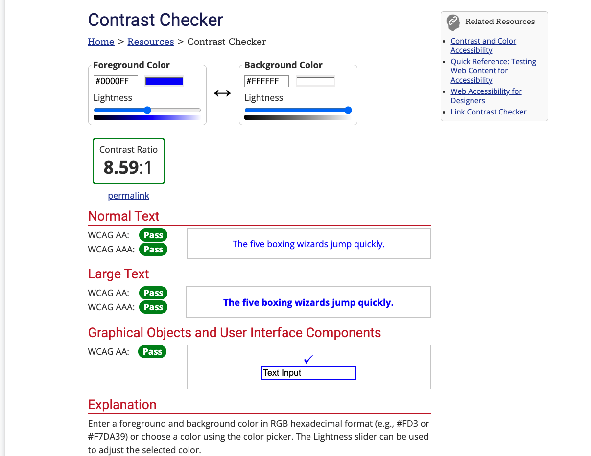
Note: A high contrast ratio will also allow anyone using a smartphone or tablet with a glossy screen to better read pages when in a bright environment, such as sunlight.
Another tip is to not rely on color alone for signposts/information, as this will be no good for those who can’t see the color. Instead of marking required form fields in red, for example, mark them with an asterisk and in red.
#### Hiding things
There are many instances where a visual design will require that not all content is shown at once. For example, in our Tabbed info box example (see source code) we have three panels of information, but we are positioning them on top of one another and providing tabs that can be clicked to show each one (it is also keyboard accessible — you can alternatively use Tab and Enter/Return to select them).
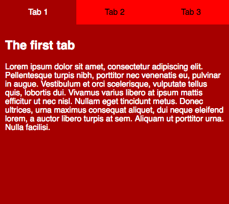
Screen reader users don’t care about any of this — they are happy with the content as long as the source order makes sense, and they can get to it all. Absolute positioning (as used in this example) is generally seen as one of the best mechanisms of hiding content for visual effect, because it doesn’t stop screen readers from getting to it.
On the other hand, you shouldn’t use **visibility:hidden** or display:none, because they do hide content from screen readers. Unless of course, there is a good reason why you want this content to be hidden from screen readers.
Note: Invisible Content Just for Screen Reader Users has a lot more useful detail surrounding this topic.
Accept that users can override styles
It is possible for users to override your styles with their own custom styles, for example:
- See Sarah Maddox’s How to use a custom style sheet (CSS) with Firefox for a useful guide covering how to do this manually in Firefox, and How to use a custom style sheet (CSS) with Internet Explorer by Adrian Gordon for the equivalent IE instructions.
- It is probably easier to do it using an extension, for example the Stylish extension is available for Firefox, Safari, Opera, and Chrome.
Users might do this for a variety of reasons. A visually impaired user might want to make the text bigger on all websites they visit, or a user with severe color deficiency might want to put all websites in high contrast colors that are easy for them to see. Whatever the need, you should be comfortable with this, and make your designs flexible enough so that such changes will work in your design. As an example, you might want to make sure your main content area can handle bigger text (maybe it will start to scroll to allow it all to be seen), and won’t just hide it, or break completely.
------------------------------------------------------------------------
Last update on 31 Jan 2022
---