Accessibility - HTML - A good basis for accessibility - 2
Information drawn from
UI controls
By UI controls, we mean the main parts of web documents that users interact with — most commonly buttons, links, and form controls. In this section, we’ll look at the basic accessibility concerns to be aware of when creating such controls. Later articles on WAI-ARIA and multimedia will look at other aspects of UI accessibility.
One key aspect of the accessibility of UI controls is that by default, browsers allow them to be manipulated by the keyboard. You can try this out using our native-keyboard-accessibility.html example (see the source code). Open this in a new tab, and try pressing the tab key; after a few presses, you should see the tab focus start to move through the different focusable elements. The focused elements are given a highlighted default style in every browser (it differs slightly between different browsers) so that you can tell what element is focused.
Note: From Firefox 84 you can also enable an overlay that shows the page tabbing order. For more information see: Accessibility Inspector > Show web page tabbing order.
You can then press Enter/Return to follow a focused link or press a button (we’ve included some JavaScript to make the buttons alert a message), or start typing to enter text in a text input. Other form elements have different controls, for example, the <select> element can have its options displayed and cycled between using the up and down arrow keys.
Note: Different browsers may have different keyboard control options available. See Using native keyboard accessibility for more details.
You essentially get this behavior for free, just by using the appropriate elements, e.g.
<h1>Links</h1>

<p>This is a link to <a href="https://www.mozilla.org">Mozilla</a>.</p>

<p>Another link, to the <a href="https://developer.mozilla.org">Mozilla Developer Network</a>.</p>

<h2>Buttons</h2>

<p>
  <button data-message="This is from the first button">Click me!</button>
  <button data-message="This is from the second button">Click me too!</button>
  <button data-message="This is from the third button">And me!</button>
</p>

<h2>Form</h2>

<form>
  <div>
    <label for="name">Fill in your name:</label>
    <input type="text" id="name" name="name">
  </div>
  <div>
    <label for="age">Enter your age:</label>
    <input type="text" id="age" name="age">
  </div>
  <div>
    <label for="mood">Choose your mood:</label>
    <select id="mood" name="mood">
      <option>Happy</option>
      <option>Sad</option>
      <option>Angry</option>
      <option>Worried</option>
    </select>
  </div>
</form>
This means using links, buttons, form elements, and labels appropriately (including the <label> element for form controls).
However, it is again the case that people sometimes do strange things with HTML. For example, you sometimes see buttons marked up using <div>s, for example:
<div data-message="This is from the first button">Click me!</div>
<div data-message="This is from the second button">Click me too!</div>
<div data-message="This is from the third button">And me!</div>
But using such code is not advised — you immediately lose the native keyboard accessibility you would have had if you’d just used <button> elements, plus you don’t get any of the default CSS styling that buttons get.
Building keyboard accessibility back in
Adding such advantages back in takes a bit of work (you can see an example in our fake-div-buttons.html example — also see the source code). Here we’ve given our fake <div> buttons the ability to be focused (including via tab) by giving each one the attribute tabindex=”0”:
<div data-message="This is from the first button" tabindex="0">Click me!</div>
<div data-message="This is from the second button" tabindex="0">Click me too!</div>
<div data-message="This is from the third button" tabindex="0">And me!</div>
Basically, the tabindex attribute is primarily intended to allow tabbable elements to have a custom tab order (specified in positive numerical order), instead of just being tabbed through in their default source order. This is nearly always a bad idea, as it can cause major confusion. Use it only if you really need to, for example, if the layout shows things in a very different visual order to the source code, and you want to make things work more logically. There are two other options for tabindex:
- tabindex=”0” — as indicated above, this value allows elements that are not normally tabbable to become tabbable. This is the most useful value of tabindex.
- tabindex=”-1” — this allows not normally tabbable elements to receive focus programmatically, e.g., via JavaScript, or as the target of links.
Whilst the above addition allows us to tab to the buttons, it does not allow us to activate them via the Enter/Return key. To do that, we had to add the following bit of JavaScript trickery:
document.onkeydown = function(e) {
  if(e.keyCode === 13) { // The Enter/Return key
    document.activeElement.click();
  }
};
Here we add a listener to the document object to detect when a button has been pressed on the keyboard. We check what button was pressed via the event object’s keyCode property; if it is the keycode that matches Return/Enter, we run the function stored in the button’s onclick handler using document.activeElement.click(). activeElement which gives us the element that is currently focused on the page.
This is a lot of extra hassle to build the functionality back in. And there’s bound to be other problems with it. Better to just use the right element for the right job in the first place.
Meaningful text labels
UI control text labels are very useful to all users, but getting them right is particularly important to users with disabilities.
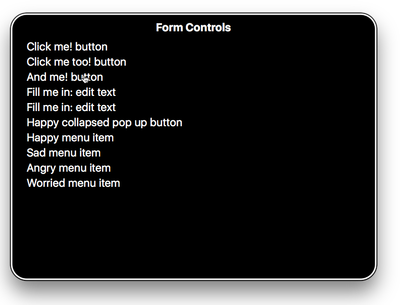
You should make sure that your button and link text labels are understandable and distinctive. Don’t just use “Click here” for your labels, as screen reader users sometimes get up a list of buttons and form controls. The following screenshot shows our controls being listed by VoiceOver on Mac.
Make sure your labels make sense out of context, read on their own, as well as in the context of the paragraph they are in. For example, the following shows an example of good link text:
<p>Whales are really awesome creatures. <a href="whales.html">Find out more about whales</a>.</p>
but this is bad link text:
<p>Whales are really awesome creatures. To find more out about whales, <a href="whales.html">click here</a>.</p>
Note: You can find a lot more about link implementation and best practices in our Creating hyperlinks article. You can also see some good and bad examples at good-links.html and bad-links.html.
Form labels are also important for giving you a clue about what you need to enter into each form input. The following seems like a reasonable enough example:
Fill in your name: <input type="text" id="name" name="name">
However, this is not so useful for disabled users. There is nothing in the above example to associate the label unambiguously with the form input and make it clear how to fill it in if you cannot see it. If you access this with some screen readers, you may only be given a description along the lines of “edit text.”
The following is a much better example:
<div>
  <label for="name">Fill in your name:</label>
  <input type="text" id="name" name="name">
</div>
With code like this, the label will be clearly associated with the input; the description will be more like “Fill in your name: edit text.”
As an added bonus, in most browsers associating a label with a form input means that you can click the label to select or activate the form element. This gives the input a bigger hit area, making it easier to select.
Note: You can see some good and bad form examples in good-form.html and bad-form.html.
You can find a nice explanation of the importance of proper text labels, and how to investigate text label issues using the Firefox Accessibility Inspector, in the following video
------------------------------------------------------------------------
Last update on 27 Jan 2022
---