
Introduction to Web Components
Information drawn from
What are Web Components, anyway?
Web Components consist of three separate technologies that are used together:
- Custom Elements. Quite simply, these are fully-valid HTML elements with custom templates, behaviors and tag names (e.g.
<one-dialog>) made with a set of JavaScript APIs. Custom Elements are defined in the HTML Living Standard specification. - Shadow DOM. Capable of isolating CSS and JavaScript, almost like an
<iframe>. This is defined in the Living Standard DOM specification. - HTML templates. User-defined templates in HTML that aren’t rendered until called upon. The
<template>tag is defined in the HTML Living Standard specification.
These are what make up the Web Components specification.
HTML Modules is likely to be the fourth technology in the stack, but it has yet to be implemented in any of the big four browsers. The Chrome team has announced it an intent to implement them in a future release.
Web Components are generally available in all of the major browsers with the exception of Microsoft Edge and Internet Explorer 11, but polyfills exist to fill in those gaps.
Referring to any of these as Web Components is technically accurate because the term itself is a bit overloaded. As a result, each of the technologies can be used independently or combined with any of the others. In other words, they are not mutually exclusive.
Custom elements
As the name implies, custom elements are HTML elements, like <div>, <section> or <article>, but something we can name ourselves that are defined via a browser API. Custom elements are just like those standard HTML elements — names in angle brackets — except they always have a dash in them, like <news-slider> or <bacon-cheeseburger>. Going forward, browser vendors have committed not to create new built-in elements containing a dash in their names to prevent conflicts.
Custom elements contain their own semantics, behaviors, markup and can be shared across frameworks and browsers.
class MyComponent extends HTMLElement {
  connectedCallback() {
    this.innerHTML = `<h1>Hello world</h1>`;
  }
}
customElements.define('my-component', MyComponent);
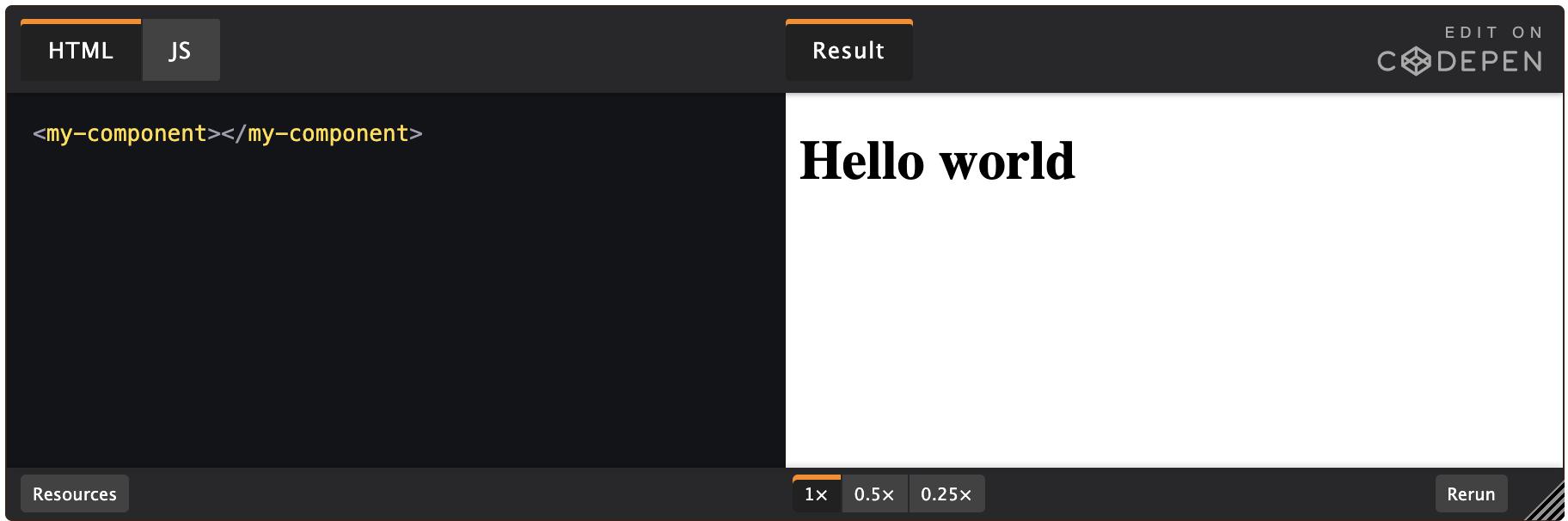
In this example, we define <my-component>, our very own HTML element. Admittedly, it doesn’t do much, however this is the basic building block of a custom element. All custom elements must in some way extend an HTMLElement in order to be registered with the browser.
Custom elements exist without third-party frameworks and the browser vendors are dedicated to the continued backward compatibility of the spec, all but guaranteeing that components written according to the specifications will not suffer from breaking API changes. What’s more, these components can generally be used out-of-the-box with today’s most popular frameworks, including Angular, React, Vue, and others with minimal effort.
Shadow DOM
The shadow DOM is an encapsulated version of the DOM. This allows authors to effectively isolate DOM fragments from one another, including anything that could be used as a CSS selector and the styles associated with them. Generally, any content inside of the document’s scope is referred to as the light DOM, and anything inside a shadow root is referred to as the shadow DOM.
Imagine the following scenario:
<div>
  <div id="example">
    <!-- Pseudo-code used to designate a shadow root -->
    <#shadow-root>
      <style>
      button {
        background: tomato;
        color: white;
      }
      </style>
      <button id="button">This will use the CSS background tomato</button>
    </#shadow-root>
  </div>
  <button id="button">Not tomato</button>
</div>
Aside from the pseudo-code of <#shadow-root> (which is used here to demarcate the shadow boundary which has no HTML element), the HTML is fully valid. To attach a shadow root to the node above, we would run something like:
const shadowRoot = document.getElementById('example').attachShadow({ mode: 'open' });
shadowRoot.innerHTML = `<style>
button {
  color: tomato;
}
</style>
<button id="button">This will use the CSS color tomato <slot></slot></button>`;
A shadow root can also include content from its containing document by using the <slot> element. Using a slot will drop user content from the outer document at a designated spot in your shadow root.
HTML templates
The aptly-named HTML <template> element allows us to stamp out re-usable templates of code inside a normal HTML flow that won’t be immediately rendered, but can be used at a later time.
<template id="book-template">
<li><span class="title"></span> — <span class="author"></span></li>
</template>
<ul id="books"></ul>
The example above wouldn’t render any content until a script has consumed the template, instantiated the code and told the browser what to do with it.
const fragment = document.getElementById('book-template');
const books = [
  { title: 'The Great Gatsby', author: 'F. Scott Fitzgerald' },
  { title: 'A Farewell to Arms', author: 'Ernest Hemingway' },
  { title: 'Catch 22', author: 'Joseph Heller' }
];

books.forEach(book => {
  // Create an instance of the template content
  const instance = document.importNode(fragment.content, true);
  // Add relevant content to the template
  instance.querySelector('.title').innerHTML = book.title;
  instance.querySelector('.author').innerHTML = book.author;
  // Append the instance ot the DOM
  document.getElementById('books').appendChild(instance);
});
Notice that this example creates a template (<template id="book-template">) without any other Web Components technology, illustrating again that the three technologies in the stack can be used independently or collectively.
Ostensibly, the consumer of a service that utilizes the template API could write a template of any shape or structure that could be created at a later time. Another page on a site might use the same service, but structure the template this way:
<template id="book-template">
  <li><span class="author"></span>'s classic novel <span class="title"></span></li>
</template>

<ul id="books"></ul>
------------------------------------------------------------------------
Last update on 29 Feb 2020
---